Wednesday, May 25, 2011

 
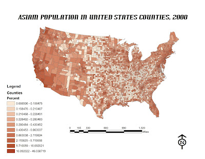
The distribution of the Asian population in the United States can be seen in the figure above.  The data is sorted by the percent Asian per county.  The densest Asian county has 46.038% Asians and the least dense county has 0.0085% Asians.  That is a range from one out of every two people to around one out of every thousand people being Asian.  The denser areas are on the California coast as well as in the New England region.  This can be attributed to immigration over the past century and a half.  On the west coast, Angel Island was where the immigrants from Asia came.  From the east coast, they came from Ellis Island, NY.  Since we are separated from Asia by the sea, the densest Asian population locations are near large ports and harbors on the west and eastern coasts.  There are not many Asians in the central portion of the United States as of now, but in a few generations I believe the Asian population will be well-mixed.


 The distribution of the Black population can be seen above in the figure “Black Population in United States Counties, 2000”.  The percentage of blacks in counties throughout the United States ranged from 0.01% to 86.5%.  That translates to one out of every hundred all the way to almost nine out of every ten people being black.  The densest population seems to be in the Deep South and along the southeast coast.  This is probably due to the early history of the United States from slavery.  Many blacks were taken from Africa (east of the United States which is why they are located on the east coast) and brought to work on the plantations in the south.  I am surprised how dense it is over there and confused on why the population hasn’t spread out and is still centrally located in the southeastern region after all these generations.


The distribution of other races in the United States can be seen in the figure above.  You are probably wondering what “other race” means, so for clarification, according to the census, 97% of the people who reported as being “other race” were Hispanic or Latino.  The range of “others” went from 0.008% to 39%.  This can be roughly translated to a range of one “other” out of every 125 people to two out of every five people.  The densest population of “others” seems to be in the southwest region of the United States.  I believe that the densest counties are located there because they are in close proximity to Mexico.  Many Hispanics are near Mexico so they can be close to their relatives who are in Mexico.  Another reason could be because they came over as immigrants and were naturalized, so they stayed in the same city. 


Overall from these maps, you can see the distribution of minorities throughout the United States.  I find it interesting how broad the density of blacks ranges.  From one in every hundred to almost nine out of every ten is a huge range.  It was also interesting to see the general trend of the minorities and how they have not moved much since they first came to the United States.  The projection, North American Lambert Conformal Conic was very instrumental in being able to accurately visualize the population distribution.  Before I changed the map projection, the map looked extremely distorted, and changing the projection to N.A. Lambert Conformal Conic made it much clearer.  It was also amazing to see how smoothly ArcMAP worked in integrating the population from the census into the US map.  The ArcGIS programmers really know what they are doing.
Thursday, May 19, 2011

DEM's in ArcGIS

In this lab, I mapped an area using a digital elevation model (DEM) outisde of Los Angeles.  Four maps were made: shaded relief, slope, aspect, and 3D.  The DEM ranged from 34.34 degrees North to 34.27 degrees North and 119.23 degrees West to 117.17 degrees West.  The GCS North American 1823 coordinate system was used.


Wednesday, May 11, 2011

Lab #5: Map Projections in ArcGIS


In this lab, we learned to create maps with different types of projections. The software that was used was ArcMAP, which we practiced to use last week in lab 4. Because the earth is spherical it is impossible to map every aspect of the planet correctly, and every projection of the globe has a “flaw” so to speak. That is why there are hundreds of types of map projections, and 66 that ArcGIS supports. There are three main categories of map projections: conformal, equal area, and equidistant. Usually one can choose a map from one of the categories based on which aspect of the map is more important.
The first type of projection that will be discussed is conformal. In order for a map to be conformal, it must have right angles, or 90 degrees, between every parallel and meridian. In order to have right angles at every intersection, conformal map projections usually sacrifice straight lines and area. For example, Greenland’s size on conformal maps is much larger than in reality because size becomes distorted near the north and south poles.

Equal area map projections, as it says in the name, maintain a relative size at every location on the map. The aspects that they lose are angles and distance. If one would like to compare population versus country size on a map, an equal area map projection should be used. It is interesting seeing the size of Antarctica on an equal area projection compared to it on a conformal projection.


The third type of projection is equidistant, which keeps an accurate relative distance between points on a map. It is most useful when trying to find how far one place is from another. The drawbacks of equidistant maps are their inability to keep correct area and angles. Also, equidistant maps usually only preserve distances under certain conditions, so it can be difficult to use the maps.


Tuesday, May 3, 2011

Lab 4: Proposed Airport Expansion


In this lab we learned to use the program ArcMap. From a first glance, it seems to be very complicated and intimidating at times. I have worked with graphics software, such as Corel Designer, and there are some features that are included in both programs and it makes it easier to understand. Overall, it is a great program that allows for extensive map-making, and I feel like I have only scratched the surface.

All students were given a tutorial in PDF form that showed what to do step by step. Having the tutorial there made it much more simplified and creating the maps became easier. I would not have known how to do this lab without it. Since it is readily available online, I can refer to it any time I am having trouble with ArcMap.

One problem that I encountered, however, was reopening the file after working on it. I had worked on the file for a few hours in lab and saved it to my flash drive. A few days later I reopened the file in the lab and saved it in the workspace to continue with my assignment, but I had to redirect the sources of all the files in order for it to work. It was extremely tedious, and I must have done something wrong. Next time I will try working on it directly from my flash drive and see if it works better that way.

GIS through ArcMap has so many potentials in expanding knowledge though informational mapping around the world. In this lab we were able to show noise radius, street names, streets, runways and several other types of information on a single map, which would definitely help someone out who would like to learn about the area. A pitfall could be that anyone can make a map, and if you make an error somewhere, not many people would be able to correct it or even notice it for that matter. That’s why I believe all maps should be cross-referenced before becoming published or “official”.